The Duo Behind wij zijn kees Discuss Big Dreams and Visual Storytelling
The Duo Behind wij zijn kees Discuss Big Dreams and Visual Storytelling
Read About How They Met and Why They Prefer to Blend Multiple Mediums Together
Name:
wij zijn kees
Words:
Erica Nichols
Photography:
wij zijn kees
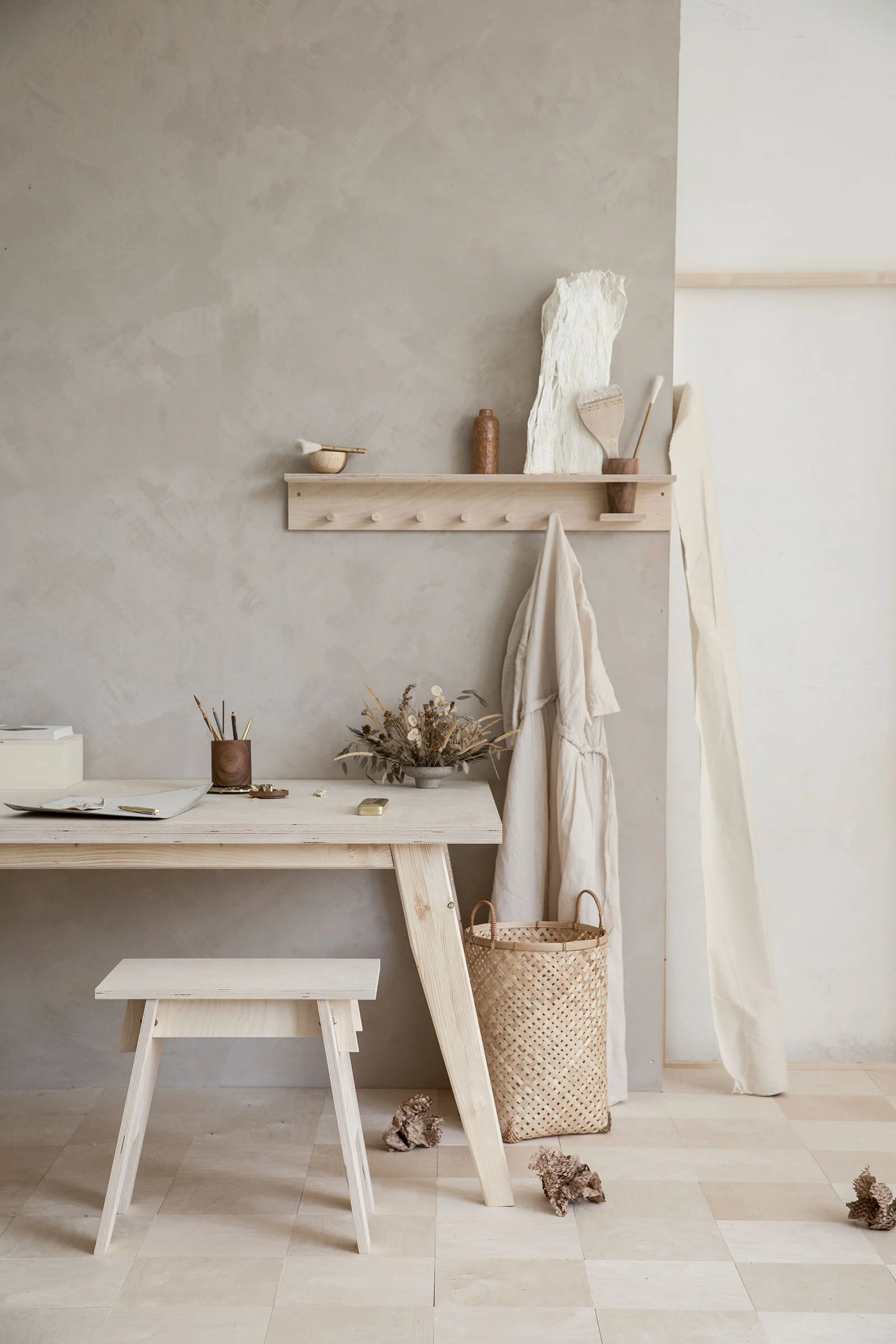
Dorien Dolsma and Jitske Hagens may not be related, but their creative minds have truly morphed into one. The design duo, who founded wij zijn kees eleven years ago, are so successful in large part to their shared taste and design approach—developing minimalistic visuals into a multi-medium story. Working with brands in a variety of fields, wij zijn kees has built an expansive portfolio that incorporates styling, product design, photography, graphic design, and so much more in each project, creating an authentic extension of the brand they’re working with. We heard from the design duo firsthand for more insight into how their signature style is, well, a little bit of everything.
VISUAL PLEASURE Magazine: Talk to us about how you met and how you formed this creative duo.
Dorien Dolsma and Jitske Hagens: We met each other while at art school. During a workshop week in Belgium, there was only one car available and we both wanted to catch the morning light. We drove around together and made separate work first, but one day we decided to work together on a series. It turned out to be the beginning of our now long work relationship. In the fourth year of our studies, we were fantasizing about a studio and working for large corporations and fashion brands. That’s where ‘wij zijn kees’ was born,11 years ago. We grew from building art spaces and organizing openings for exhibitions, to what we do now—a studio for design, styling, and photography.
Styling, photography, branding, graphic design…the list goes on—you are able to do so much! Do you have a favorite creative medium?
We really like the combination of all these mediums together. And it’s always a dream when we’re asked to create a complete story for a brand. Then, we’re not a small part of the creative progress, but we can build from scratch and combine all our mediums into something visual. Don’t get us wrong, we also love to work on smaller projects. When we feel connected to the brand, or the people behind the brand, there’s a magic that happens in the creative process.
Talk to us about the importance of storytelling in your work, specifically through minimalistic avenues. How do you develop these stories?
From the very first second an email drops with the explanation of a project to creating the images, intuition is key in our work. As a duo, we often think about the same structures and colors. It happens quite a lot that we are both ‘pinning’ the same inspiration for a project. And when one of us shows an idea, the other is inspired and this leads to a concept, a story.
What have been some of your favorite projects you’ve worked on?
Hard to pick a few, we really love all of our work. We’re going with the flow with what comes our way. When a baby brand asked us to develop a new brand with them, we were so excited. This project was the first where all mediums were combined. And the project was a boost for our product design skills. It showed us that we don’t want to have any limitations in our work. This all is also coming together in our work for Sticky Lemon and Monk & Anna. Together with the owners, we developed both brands, created the names, and identity. We’ve been part of the product design team since day one and create most of the visuals. But to wrap it up, we both really like to create when there is not much to work with so that we can really build the brand.
Why do you think a minimalistic approach is so effective?
There is already so much going on in the world, that we are just drawn to the minimalistic approach. Personally, we both are living a more minimalistic lifestyle. Our work is a reflection of who we are, minimal but rich in tactility, structures, and colors. When we create our own Instagram content, we prefer the images that are calming and serene.
When you are free to create on your own, what do you create? What mediums are you drawn to?
We’ve actually been longing to explore and create outside of our work, but we haven’t had the time to do so. Two years ago we did a ceramic course for a week in France and that was inspiring and addictive, in a good way. It was so peaceful to work with clay. Besides clay, working with fabric would also be one of our mediums. Sometimes, we dream of turning ‘wij zijn kees’ more into a brand (beside the studio work) where we have a small clothing line, some ceramics, and woodwork.
What or who are your major sources of inspiration?
We’re inspired by the daily life that surrounds us; by the beautiful images, products, and design other creatives make. And nature is always a huge source for color schemes and textures.
In a commissioned project, how do you find the balance between artistic integrity and client preferences?
Most of the times our clients are trusting us in the work we do for them and that creates an environment of freedom within the project. We also believe that we, the client and we, as a team, can create just that little bit more if you click all together. The ‘one plus one is three’ feeling. We had to learn to trust our inner compass to find out which client is a match and which client is not. So also here our intuition plays a big role in shaping the project in a way where we can fully bloom. If you are clear from the start, it benefits the creative atmosphere.
Talk to us about how you select colors, objects, textures, etc. for your projects—how does each project develop?
We usually collect images of all kinds of things that are an inspiration for the project we’re working on. After collecting, we design a moodboard for the client to translate our thoughts, ideas, concepts. Sometimes we feel the need to experiment with textures and develop our own texture with paint, paper, or fabric. Also here, our work is very intuitive. We try to gather as much information from the client as possible. This is our base, the information is our inspiration. It automatically starts to bubble.


