Visualizing Distinct Minimalistic Sceneries With Cristina Lello
Visualizing Distinct Minimalistic Sceneries With Cristina Lello
Designer Cristina Lello talks her creative approach and broad inspirations
Designer:
Cristina Lello
Photography:
Cristina Lello Studio
Words:
Caroline Meeusen
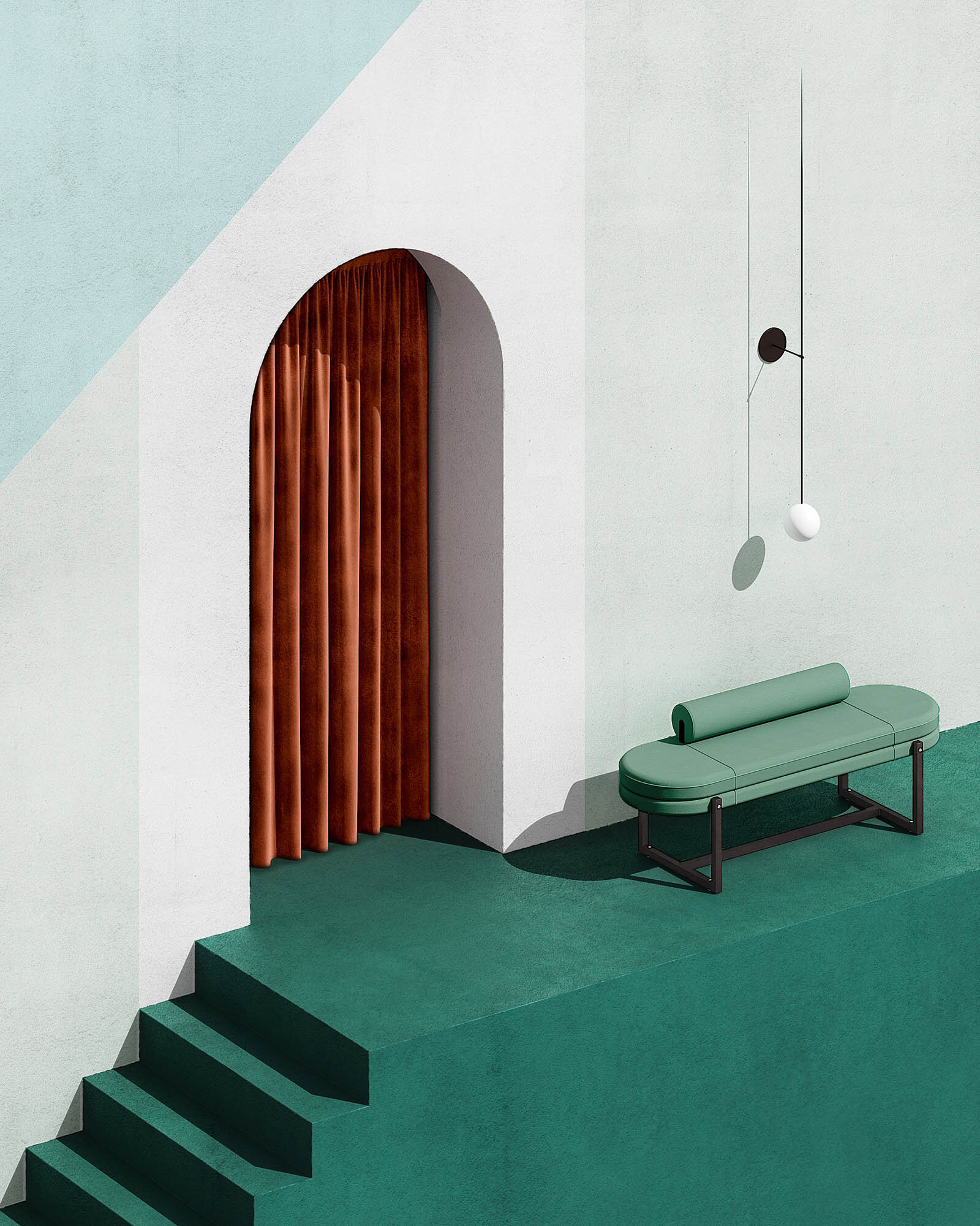
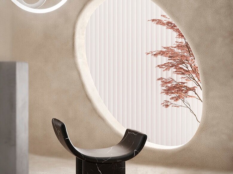
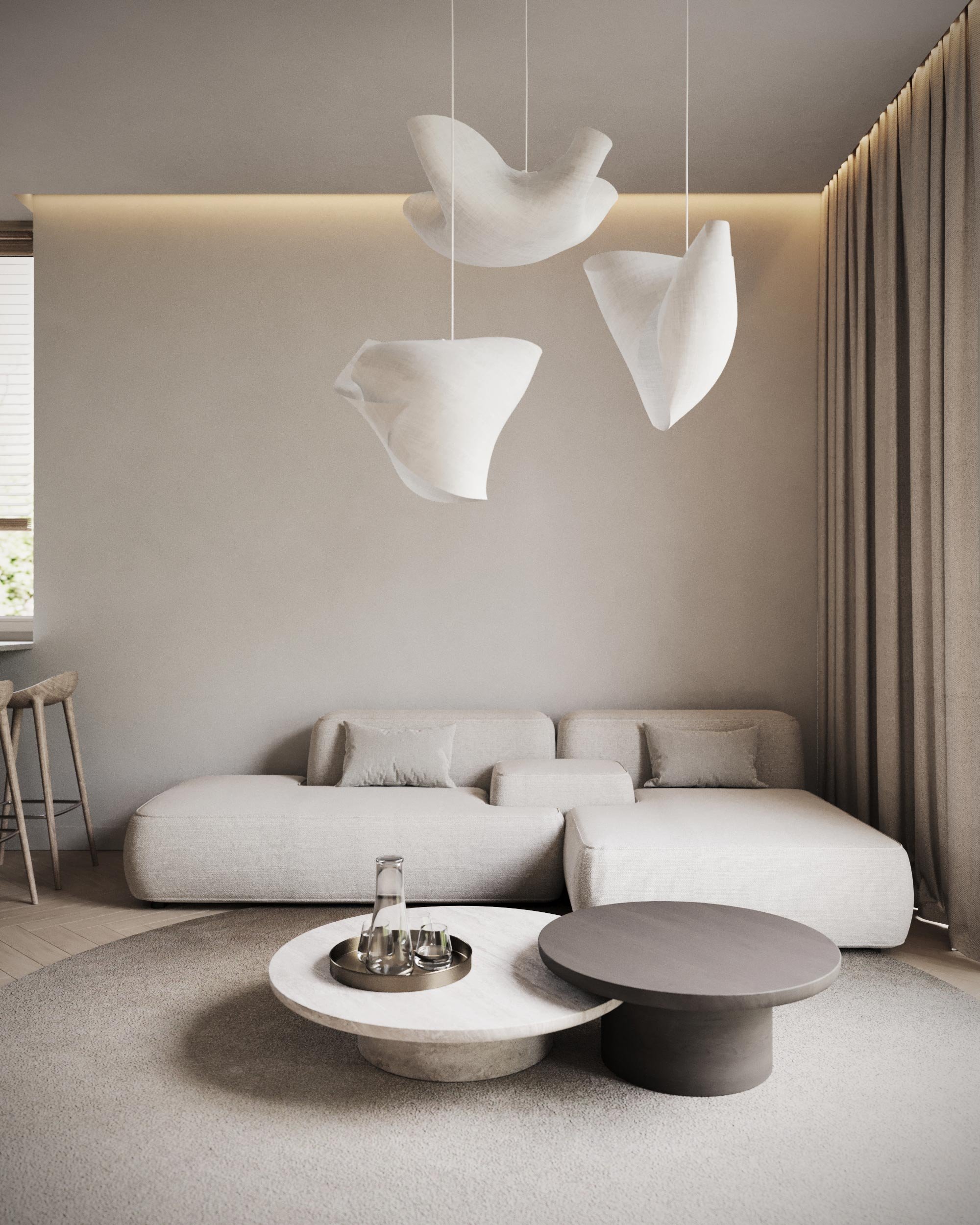
Having always been fascinated with sensational spaces, Cristina Lello now visualizes the most striking scenes that tell a clear story. As she describes herself, her studio “creates high-impact images from the intersection of interior styling, set design and 3D art.” After graduating with honors in Set Design at the Academy of Fine Arts of Venice, she also started a Master’s degree in Interactive Media for Interior Design while working for Elisa Ossino Studio. She even got appointed as art director for the Iuav research center MeLa Media Lab. Since then, she has collaborated with prestigious brands and agencies on many successful projects. In every project, a minimalistic yet strong style defines her work. We talked with Cristina about her creative approach and the fundamental elements of her projects.
VISUAL PLEASURE Magazine: What’s the story behind your studio?
Cristina Lello: I have a background in art studies. I've always been fascinated by the design of spaces that create sensations. Initially, I cultivated this passion during my studies in set design for theater and entertainment. Over time, I approached the product communication of interiors, during a master's degree I attended in Venice and then working in a well-known creative agency in Milan. I realized then that this was the path I wanted to take and from then on everything was very natural.
How would you describe your creative approach in projects?
Every project for me is based on three fundamental C's: Culture, Context, and Contamination.
Culture means to be able to sink the roots firmly in the worlds of art history, visual psychology, architecture, and design. Context means being aware of the objective and the needs of a given project. A good understanding of the context means being able to choose the right methods and tools to achieve a certain communication result. When I work on a concept, I experiment with new languages freely, while when I work on commission the approach is more pragmatic and aimed at creating a result that is effective in the communicative context in which my client must move, while maintaining a very clear and decisive language made of spaces, lights, shapes and materials. Finally, contamination means to maintain a continuous curiosity about worlds different from one's own: from the meeting of different cultures, sectors or artistic practices can arise beautiful ideas.
What inspires you?
I often find myself observing classic paintings that can inspire compositions, or fashion that can inspire the choice of a color palette. At a certain point everything is united in a very natural way in a creative concept. My artistic research is a constant blend between the worlds of architecture, painting, photography, graphic design, and fashion. At the base of my work, then, there is an artistic background very much linked to the Gestalt principles of visual perception. I try to avoid looking for inspiration only within the confines of my sector: I find that this often leads to a flattening of the creative result.
How would you describe your style?
My artistic research is based on different styles, but the constant aspects are minimalism, geometry and a strong graphic imprint. I draw my images with the aim of striking the observer, fascinating him, regardless of the type of emotions transmitted from time to time.
How do you manage to incorporate your own style in the projects, but still stay true to the brief and style of the client?
I try to maintain a clean image and graphic balance in all the projects in which I work. This does not mean that I cannot adapt my style to the brief: it often happens that I have to make compromises, it is right to respect the style of the customer. From time to time the objects on stage, the style of the lights or the shots can change, but the basic design rules that I apply in all my works do not change.
Your sets and designs look quite minimalistic and sober, but still they exude such power and are mesmerizing, grabbing the viewer’s attention. How and where do you find the balance?
I really appreciate the fact that this dichotomy is evident. In my works I strive to “subtract the obvious and add the significant” (John Maeda, ‘The Laws of Simplicity’). It is not always easy to achieve a perfect balance between these two aspects, I don't really have a specific recipe. It is a continuous search for new possibilities of synthesis and dialogue between lines and surfaces, between light and shadow, between full and empty.
What do you think is the most important in designing a set/3D set up/interior?
Architecture and furniture are important elements, but they are not the only ones to consider. Lights and shots are equally important elements, which unfortunately are often taken for granted and overshadowed--nothing could be more wrong. We are talking about images, not habitable spaces: we must strive to understand the difference between these two contexts; images have their own rules, their alphabet, which is different from that of architecture.
We can also use the most particular architecture or the most beautiful products in the world in an image, but if we don't understand the rules of visual composition, the result risks being weak, imperfect, incomplete.


