Tour a Sober Geometric Architectural Gem in Mexico by WEWI
Tour a Sober Geometric Architectural Gem in Mexico by WEWI
WEWI Contrasts a Simple Architectural Exterior With a More Complex Monochrome Interior
Project:
House Nizuc 01
Architects:
WEWI Studio
Location:
Puerto Morelos , Mexico
Photography:
Cesar Bejar Studio
Words:
Caroline Meeusen
The Mexican interior and architecture studio WEWI strives to bring new and fresh ideas to the city they call home. Exuding a sober, natural, and minimalistic atmosphere, House Nizuc 01 is a perfect representation of the style for which WEWI Studio is known and praised. The home is located in the Mexican town of Puerto Morelos on a corner lot close to a park. Taking full advantage of this greenery and wanting to reverse the typical plan of a house, WEWI Studio decided to place the garden in front of the house connecting it to the park and the garage at the back.
“We had carte blanche for the design of this house. Therefore, we proposed an architecture and building which lives up to its interior, articulated by the two double heights. We opted for a very big and spatial sensation and a fresher interior, breaking the idea of the common sale house,” the studio notes. Most of the time these kinds of residential complexes that are built to sell don’t have any interest in the context, climate conditions, or the views, which are exactly the elements that play the leading role in WEWI’s visual story.
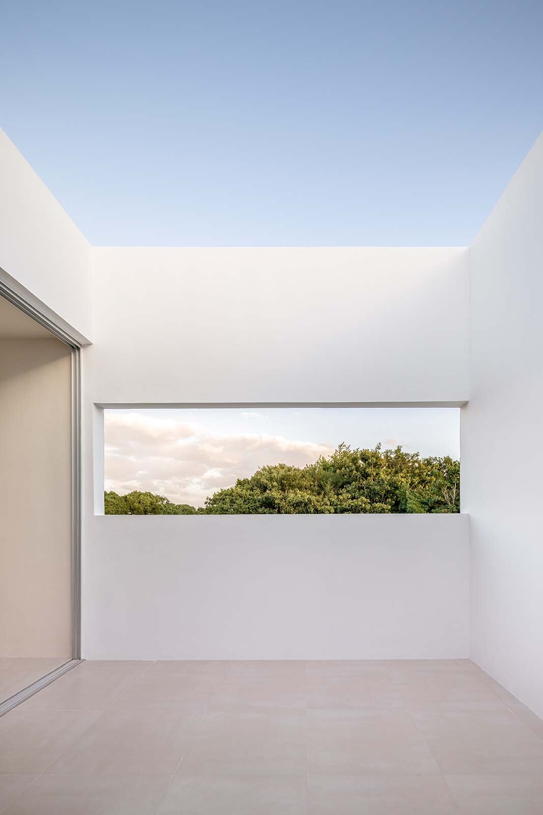
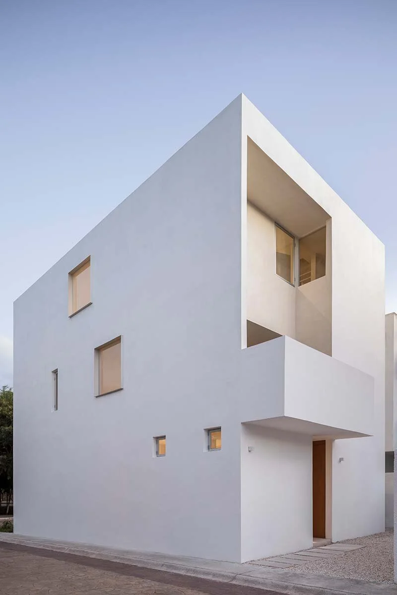
The architecture and layout of the house are quite unusual as well, appearing as a large white block with uneven window placements and openings. These irregular elements provide framed views of the garden and private terraces. The strong sense of geometry in the exterior continues on the inside, though the simplicity of the outside layout is contrasted by the intersecting, double-height interior plan. Creating a triple-height diagonal look, the spaces look and feel very dynamic and spacious.
Softening the complicated layout, WEWI used a sober color palette of beige and white tones to unite the rooms. The restriction of furniture and materials and the use of an understated palette enhances the minimalistic look. “We were very happy with the results. It was our first residential project, a great opportunity to turn some design ideas into reality, to test materials and the use of natural light, and to play with spatial sensations.”


