Dreaming Up Architectural Landscapes With Alexis Christodoulou
Dreaming Up Architectural Landscapes With Alexis Christodoulou
The Cape Town-Based Artist Talks Social Media and How His Side Hobby Became His Main Profession
Artist:
Alexis Christodoulou
Photography:
Alexis Christodoulou
Words:
Erica Nichols
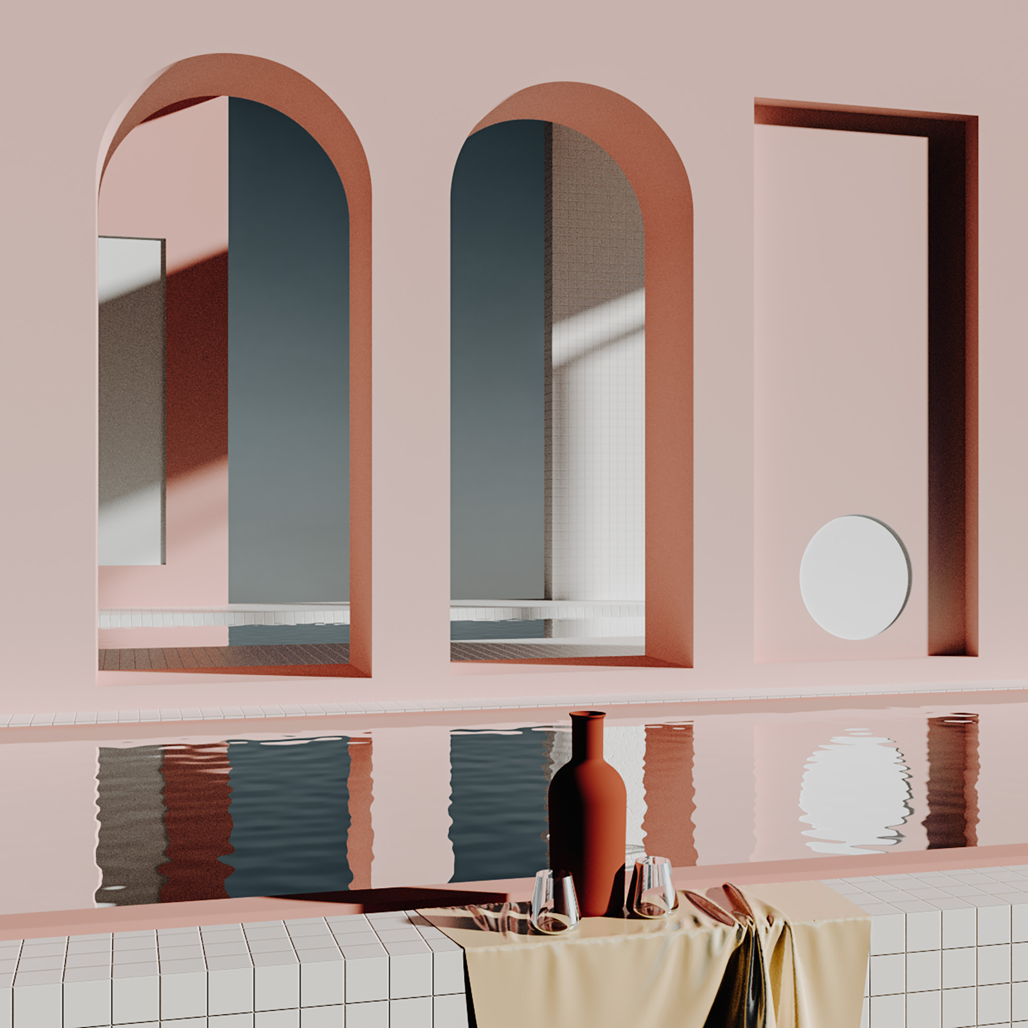
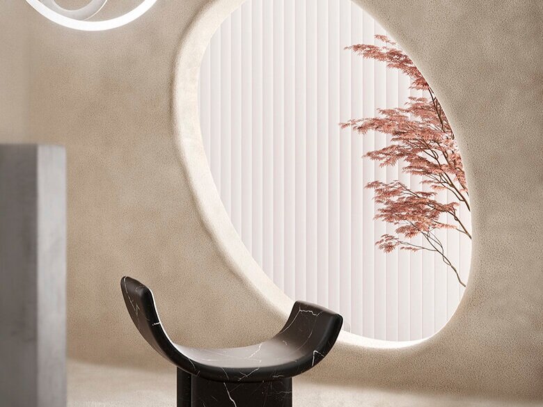
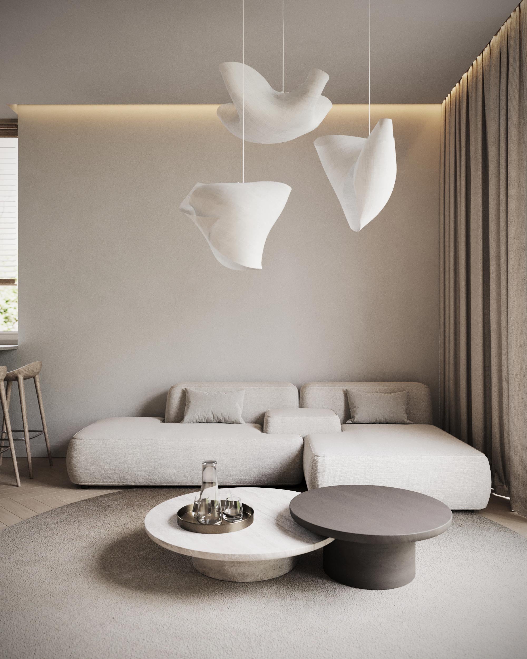
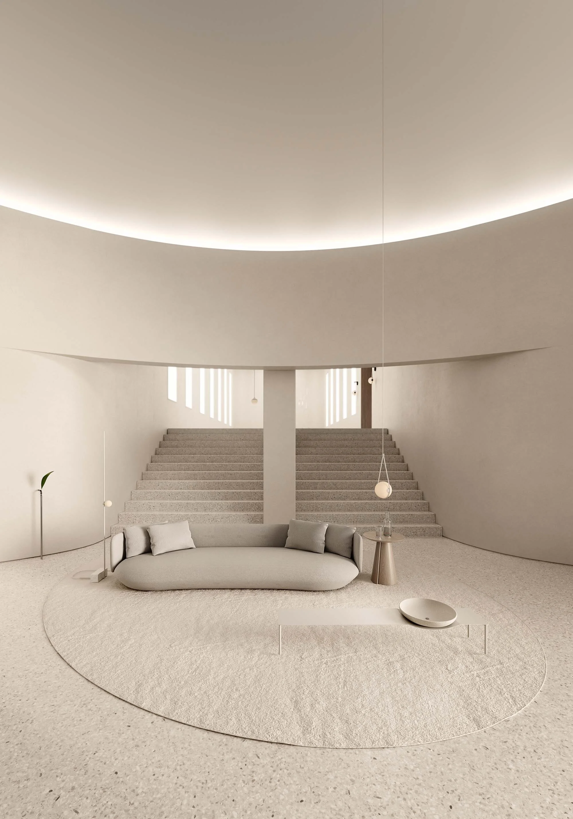
It’s hard to believe that Alexis Christodoulou once considered his 3D design as only a side hobby. Today, the digital artist has garnered a dedicated following of over 100k on Instagram with his detailed, architecturally-inspired imagined landscapes. In inviting shades of pinks, yellows, greens and blues, Christodoulou creates mesmerizing worlds for viewers to step into. Worlds featuring textured surfaces, curved objects, drastic lights and shadows—places where the indoors and outdoors blend seamlessly into one. Not bad for a guy who first taught himself 3D rendering off YouTube tutorials as a way to break up the pace of his copywriting job. Now experimenting in ways to push the boundaries of his artistic medium even further, the Cape Town-based artist gave us a closer look into how he creates and his thoughts on social media.
VISUAL PLEASURE Magazine: You’re a self-taught 3D artist. Talk to us about how you got started and what that initial learning process was like.
Alexis Christodoulou: It started off as a hobby. I’m a copywriter, which is what I studied in advertising, and so I always needed some sort of creative outlet. I was writing scripts and screenplays at the time and I was just getting frustrated with it, so I started teaching myself 3D work on the side. I’ve always loved the idea of being able to make 3D visuals. My brother and I have been playing video games since we were very young, and I’ve always been fascinated with computer graphics—even when they were really bad. Just the fact that they were three-dimensional was enough to interest me. When I realized that I could go on YouTube and find hundreds of tutorials readily available for whatever you wanted to know, I just dove in and started playing around. Of course, I didn’t come right out of the gate creating the architectural spaces I do now. All I had ever seen were science fiction environments and fantasy environments—everything had a strong thematic sense and there was nothing save for a few games that really conveyed reality. I had to learn the foundation and build upon that.
When you first sit down and start on a project, do you already have an idea of what you want to create? Or does it develop as you go?
It really depends. If I”m doing an image for myself, I usually start off with an idea that I like or a theme or image that I want to develop. I build a reference board with things that I’ve seen during the day or photos from my travels on holiday, items that spark ideas in my head. So often I’ll set out with an idea of an image that I want to create and more often than not, new ideas will come up in the process and the piece will end up looking nothing like the original image. But when I’m working for a client, I’m much more disciplined in my direction. I will always be learning, so my approach changes all of the time. How I was building images one year ago is completely different to how I build images today—even just from a confidence perspective.
Is there a drastic difference with the end results in your commercial and personal projects?
There are some commercial clients that come to me because they see what I’m doing on Instagram and they are looking for something similar. They want me to render it in my own way and they end up incredibly happy with the results. So in those cases it’s wonderful. There’s a real benefit that I’ve been able to develop a very defined aesthetic for myself. People come to me for that aesthetic. Occasionally, I’ll get jobs where people really just want my skills instead of my artistic approach, I’m still learning which projects will work and which won’t. I find with 3D that it’s still quite young in comparison to other industries, so there’s still a lot to learn. As the trend of 3D renders grows, people will be able to explore more on what is possible and what’s impossible.
You have quite the following on Instagram. What role has social media played in your career and artistic approach?
It's a double-edged sword. On one hand, I wouldn't be able to do what I do for a living if it weren’t for platforms like Instagram, certainly not on a freelance basis. But I also really struggle with learning how to deal with the echo chamber of Instagram. I can see my images getting reproduced in different ways and it’s been an incentive for me to carry on pushing what I do and reinventing myself and my work. It’s this two-way street because it’s also very flattering that people would even consider copying my aesthetic in anyway. I’ve learned not to take social media for granted at all. I understand that tomorrow Instagram could just change something in the algorithm or take away the like button, and the whole system could collapse. So I don’t look at it as a stabilized platform, but another tool that I can currently use to further share my work.
It seems like nature and natural elements make up a large part of your portfolio. Has nature always been a source of inspiration?
If you look at the progression of my work, it’s really been the improvement of my technical ability that has allowed me to incorporate natural elements. It’s a theme now that I like to expand on. If you go back to really early images of mine, you'll see that there's very little natural elements. There's just water, which is something for me that's very simple to do, and shadows of plants instead of actual plants. Then as the images progressed, I became more technically proficient in actually creating natural environments. I’ve always wanted to incorporate nature into my images. I find that one massive plus of modernism in architecture is incorporating landscapes or thinking about the landscape as more than just the building. So it's always something that has been at the forefront of what I wanted to do.
You’ve said in a past interview that you like your images to have an unrealistic quality. How have you developed this over the years?
It's difficult looking at my Instagram to see that there are different phases in my work. When I was making these very sparse, white empty images, I was trying to convey a sense of emptiness and create an environment that nobody would really build. I wanted to create a visual representation of spaces that I knew would be entirely impractical for whatever reason, I found a humor in exploring that idea. Now I’ve been experimenting with creating images that could exist. But my work will always have that quality of hyper modernism.
What is your process like when incorporating shadows, lines and forms into your work?
I seldom plan it up before I start making an image. I sketch in 3D and then I paint over that in 3D, then I do the final image. Each one of those phases builds on the one before, but the first phase always starts with turning the lights on and seeing what’s going on. Most tutorials I watched would say to build the environment first, whereas I have a conscious flow and one aspect will already have marble detail and sunlight on it. I think those things are the most important parts of the image, so I try and put them in as soon as possible, as opposed to leaving them right at the end.
Was there a specific moment for you where you realized that this didn't need to be a side hobby?
I do still have my old job, which is making wine. 3D was a hobby and winemaking was my main income and now they’ve switched, which has been such a blessing. When I became popular Instagram, suddenly there was an influx of emails and people were asking me to render projects and I realized I could charge for it. I also realized then that people were happy to pay for quality work. I often have my laptop with me in the cellar and while I’m busy pressing grapes, I’ll render a job. Sometimes they can really overlap with each other, and then they also both seem to have periods where there isn’t much happening at the same time. They do definitely clash and at some point I struggle with doing both. But right now I enjoy doing both of them and will continue until that changes, if it ever does.


