Artful, Earthy Design Takes Center Stage in This Modern Minimalist Home
Artful, Earthy Design Takes Center Stage in This Modern Minimalist Home
Studio LIO and Intro DizainaS walk us through this collaborative home project
Project:
Studio LIO x Intro Dizainas,
1076.39 square feet,
2 floors
Location: Kaunas, Lithuania
Designer: Intro Dizainas
Images:
Studio LIO
Words:
Erica Nichols
The best interiors are those that reflect their inhabitants. For modern classics designer Girstė Urbaitytė, Intro Dizainas every project is a collaborative effort with the client, embedding their essence into all of the details of the home — from existing forms to curated focal points. But sometimes, certain projects call for that extra artful touch. When they do, 3D visual artist Elizaveta Oputina, Studio LIO, is able to apply her expertise to bring the full vision and feel of the home to life through masterful renderings. For this earthy two-story home, Girstė and Elizaveta teamed up to create an intimate, texture-forward haven. Learn more about the project in this exclusive interview below.
How did the vision for this home project form?
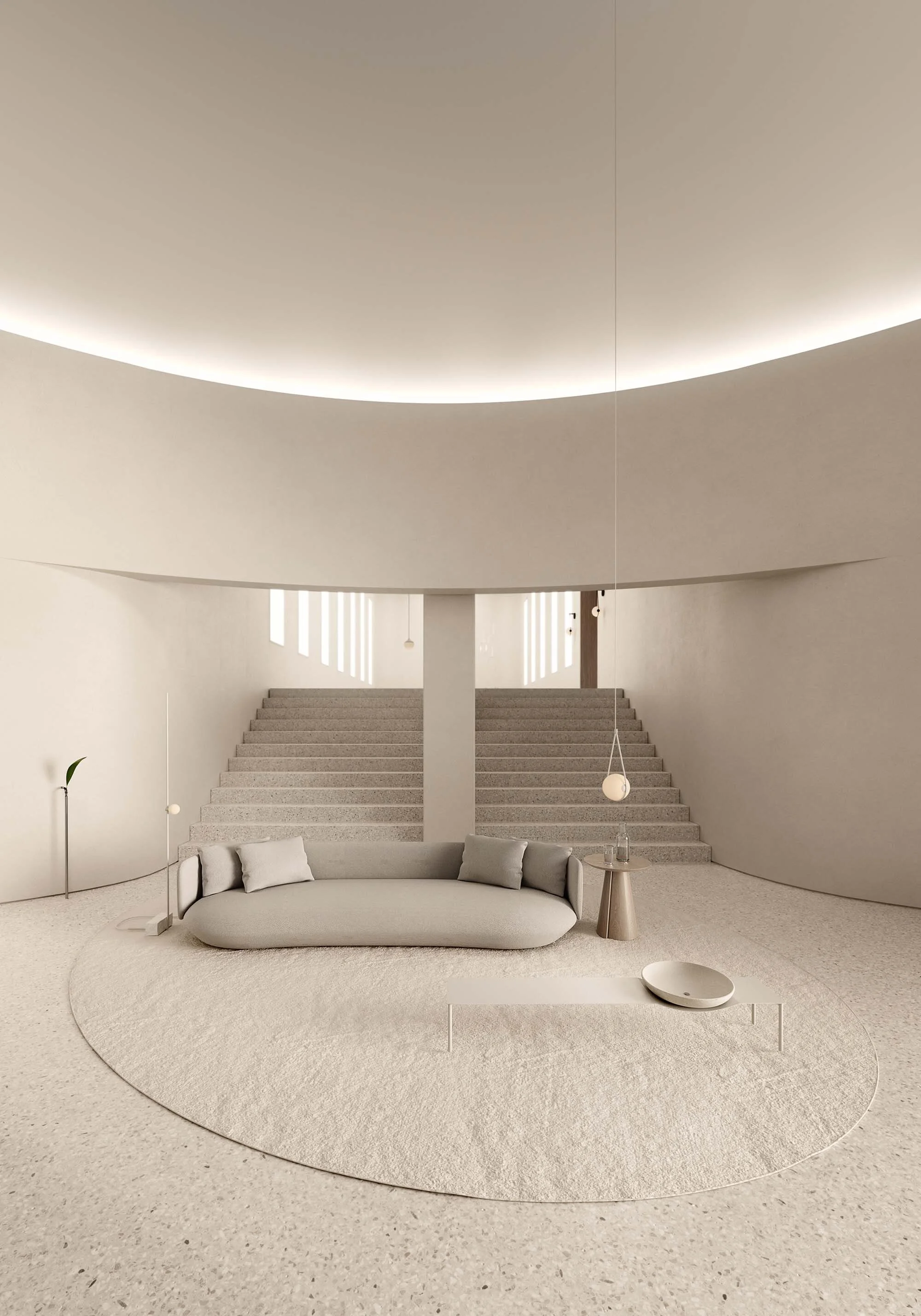
Girstė Urbaitytė (GU): Our client is a young woman working in cosmetology. So it was immediately evident that the home should have great aesthetics and look delicately beautiful. Early on, we knew she wouldn’t want expressive materials or unnecessary objects. We loved the vision of natural woods, earth materials, neutral color palettes, and uncluttered spaces accented with functional pieces like chandeliers and textiles.
How did the original space inform your design?
Elizaveta Oputina (EO): The original layout of the house was compact yet functional. All rooms had great lighting with large windows.
GU: We were really pleased that the window paneling was light wood and blended well throughout our design. The existing large windows allowed us to use dark materials and still have a cozy, bright atmosphere.
How did you blend your individual artistic styles?
EO: Each of us has our own unique artistic style. I prefer minimalism, while Girstė often works with modern classics.
GU: Even though sometimes my projects may seem completely different, they all have the same aesthetic and elegance. I've seen Elizaveta's work online and understood that we share the same perception of aesthetics.
EO: In this project, we consciously merged our styles to create a richer and more diverse design. Our combination of ideas and approaches ultimately resulted in a more interesting and harmonious outcome
What were the most important features to get across in the design?
EO: My role was to establish the overall atmosphere of the house, achieved through a combination of materials and lighting. Additionally, I focused on details such as furniture placement, accessories, and decorative elements to give the interior a unique character and style. In the end, being a 3D interior visualizer requires not only technical skills but also a sense of style and aesthetics. It's the art of turning concepts and ideas into visual reality that allows clients to envision what their home will look like.
How hands-on are you with your client throughout the process?
GU: The client loves her personal space, so creative consultation and work took place only in face-to-face meetings, and we solved technical issues mainly by phone and letters. When creating an interior, I present at least a couple of design options. By collaborating with Elizaveta, we got a much faster creative process because we didn't need to rethink a lot, which is very gratifying. But I believe all three of us had the same design idea in mind.
What’s the benefit of collaborating with another artist on a project like this?
EO: Collaborative projects bring additional expertise and creativity to the table. It also allows for exploration of new ideas and approaches that could have been challenging to implement alone. I really enjoyed working with Girstė, I believe it was a great team effort.
GU: Elizaveta combined everything I had designed with a new creative approach and offered beautiful solutions.
Walk us through the project — what are some of your favorite features?
EO: One of my favorite features of this project was the texture of the materials used. I particularly love the combination of wood and metal that we applied in the kitchen. The serene color palette won't go out of style over time. Subdued colors and the presence of dark accents make this interior anything but dull.
What are you most proud of?
EO: I take pride in being able to create beautiful and realistic renders that allow the client to immerse themselves in the interior. I believe this is crucial in the work of a designer. I think I've managed to showcase the interior in the best possible way, thus gaining the client's loyalty.
Where do you see design going next? Any trends you’re excited about or want to explore?
EO: I believe that design will continue to evolve toward sustainability and eco-friendliness. I'm also interested in the integration of new technologies into interior design, as I think it will lead to more intelligent and functional designs. As a 3D artist, I'm curious about how artificial intelligence will develop in this field. Already, it can assist in shaping ideas and concepts, and I believe its capabilities will only expand further in the future.


