LOEHR Combines Passions, Craft, New Perspectives, and Brotherhood
LOEHR Combines Passions, Craft, New Perspectives, and Brotherhood
LOEHR Talks Balancing Family and Work While Creating Inspiring Designs
Name:
LOEHR
Photography:
LOEHR
Words:
Caroline Meeusen
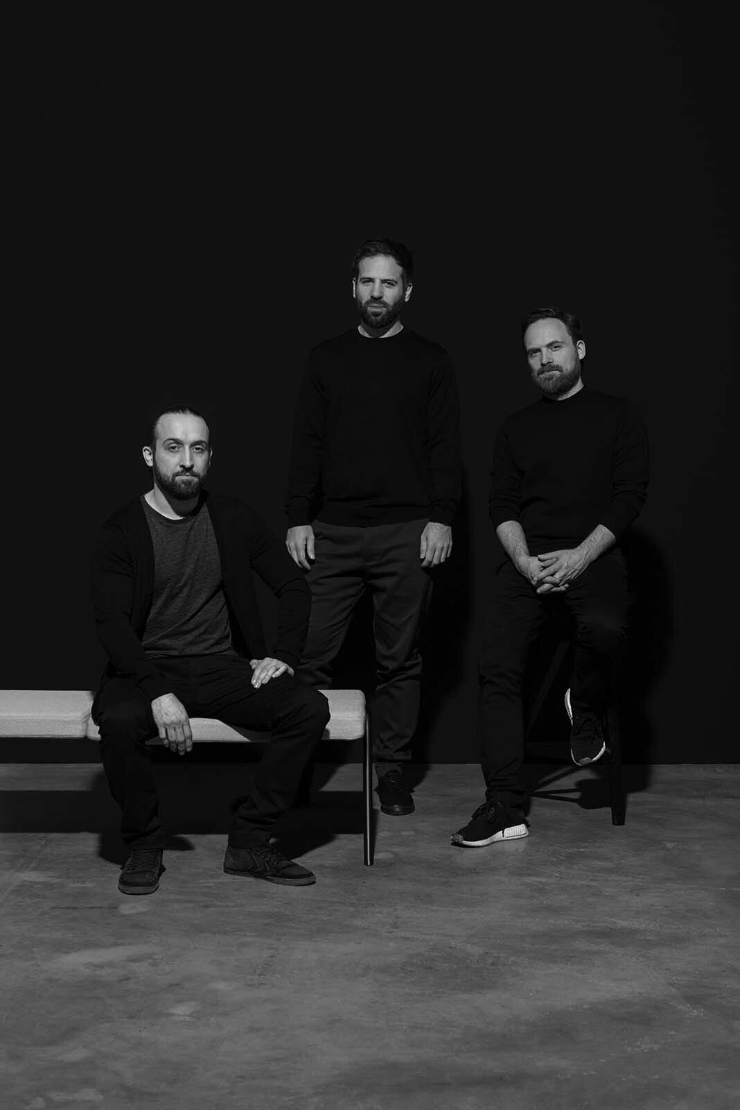
LOEHR is a Berlin-based design studio that combines the talent, interests, and passions of three brothers into one brand. David, Leon, and Julian Löhr founded LOEHR creating furniture and objects in “a constructive interplay of force, planes, and materials.” So it is no surprise that their brand name derives from their last name: In German, ‘‘ö’’ can also be written as ‘‘oe’’, which is completely identical. Setting the name with an ‘‘oe’’ works much better visually and internationally, according to the brothers.
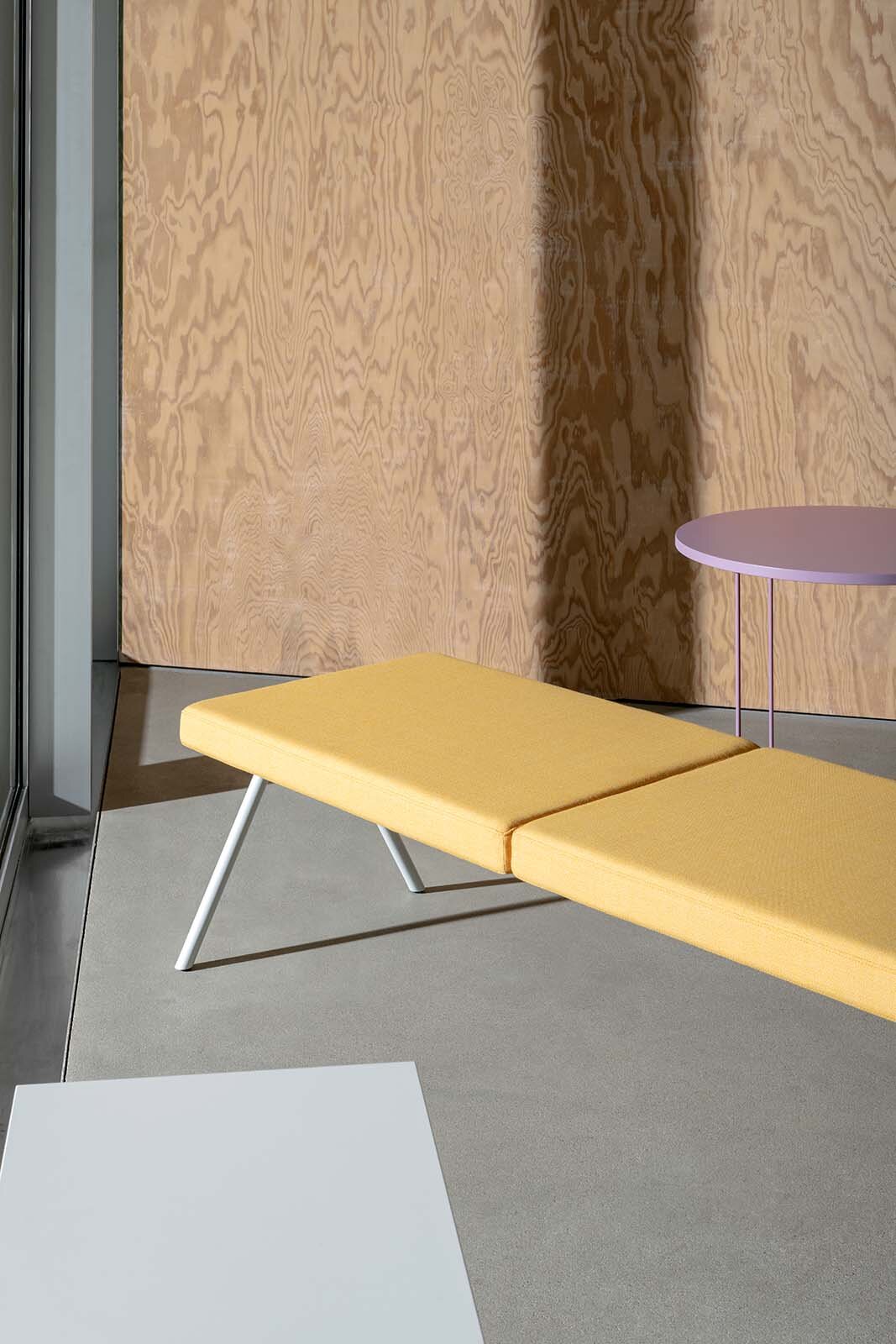
By reducing their designs to the essential they change perspective and focus on the true and radical nature of the objects. The collections take inspiration from Modernism and architecture which results in new views on spaces, original designs, and a contemporary aesthetic. Focusing on sustainability, LOEHR makes all of its products in Germany with a selected network of partners. Though they create their own amazing collections and projects, the brothers also see LOEHR as “a platform to integrate the work of other authors, designers, architects, or artists in the form of commissions, cooperations, and editions.” The brothers of LOEHR tell us more about how it all began, family bonds, and new perspectives.
VISUAL PLEASURE Magazine:
What gave you the idea to start LOEHR among the three of you?
LOEHR: The idea to design furniture originated in a discussion between Julian and David, the educated designers among us, a little more than 10 years ago. Julian brought up a range of furniture designs from the context of an interior project as he was still a student back then. That occasion sparked the idea to do something together in that field. A couple of months later, when Julian spent half a year in Berlin, he and David further developed and refined the designs, built prototypes, and thought about a strategy for how to realize them.
We considered being a studio, pitching our designs to manufacturers, but quickly felt that being a manufacturer ourselves might be a better way for us. That way we would have control over the development, the manufacturing process, the communication, and could build a brand. That was the point when we asked Leon, who was based in Hamburg at that time, to join up and found the company together. We had zero experience, so that decision was driven by a gut feeling, not business-oriented rationalism. In fact, we treated our endeavor more like a project in the very beginning, eager to get somewhere, but also not bound to a certain goal.
How is it to work with family, and more specifically with brothers? What are the (dis)advantages?
Well, there are indeed two sides to it as you already presumed with the question. On the one hand, we have a base of trust and understanding between each other that runs deep as it is with family. On the other hand, we are business partners and sometimes that means actively leaving family ties and the roles of being brothers aside. Especially in the beginning, it was—and sometimes still is—not always easy to bring those layers of our relationship into harmony. But over the years, we have developed a way to balance that. What greatly helped is to understand LOEHR as an entity that is closely connected to us, but also something that has its own nature.
What’s LOEHR’s main principle/ design philosophy? What does the brand stand for?
The work of LOEHR is defined by a tension between a rational, architectural approach on the one hand and a very expressive, sculptural language on the other. We really aim for the space where they overlap, the interplay between these opposite poles that can be distilled into a design. It is about a progressive attitude to see things differently, construct in innovative ways, and break up known typologies of furniture and how to furnish space.
What do you want the furniture to express or evoke?
We want our products to radiate what the brand stands for off upon their users. We do not want to create conformist objects that are not too compliant and that subtly encourage reflection. We like to make our thoughts about construction and character visible in the product itself. We want people and architects to be able to create a unique image with our furniture, play with the colors, shapes, scale—and place them in unexpected places and spaces.
Your pieces seem very modern and “simple,” how do you keep them interesting and significant?
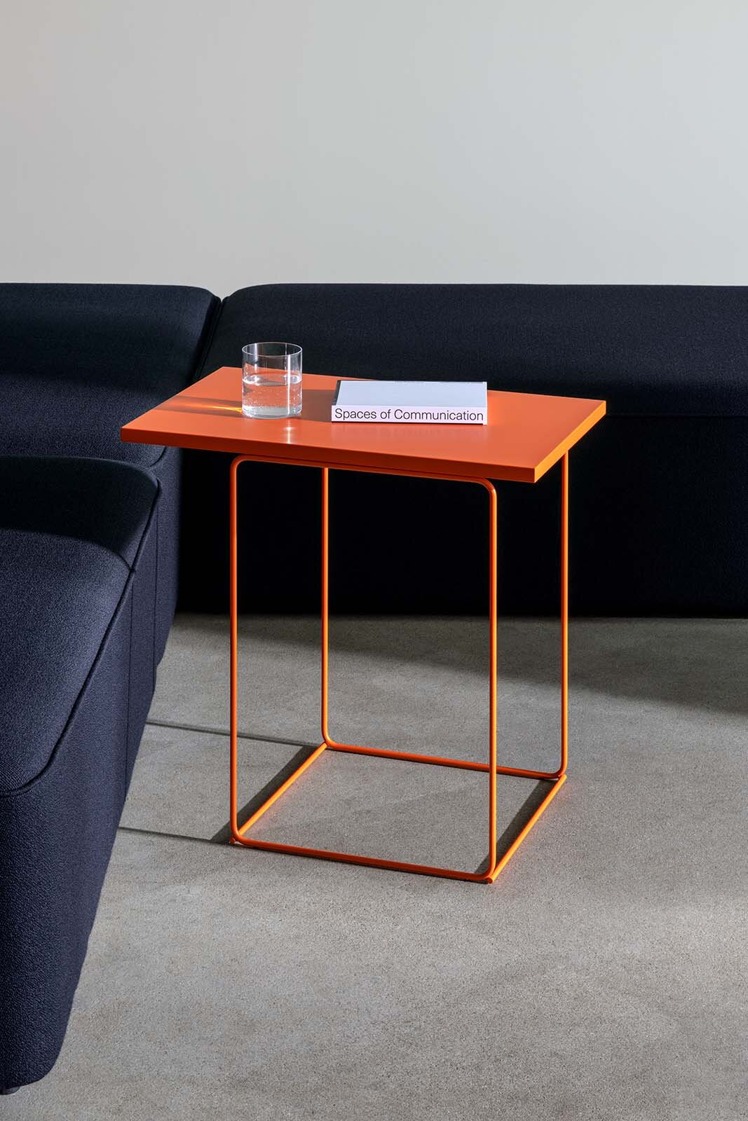
That question needs to be answered for each piece we create. Let us give two examples: The NEWTON shelf, for instance, is defined by the ingenuity of its construction. When understanding the interaction between the shelf board and the mounting rail, this experience communicates all our effort that has been put into the design at this very moment. The TANGRAM and UMBRA side tables might seem very generic and probably not very spectacular as a single piece, but we express their unique character in scale and composition of multiple items.
What materials and colors do you love and prefer to use and why?
Our designs are primarily based on classic materials like wood or steel. We are generally more construction-driven than material-driven, so the choice of material is often depending on the engineering of the product. But then, of course, the materiality has an impact on the haptic character of the product and we want to be honest with that. Practically speaking, we would never use wood-like plastics or metal-like wood. The properties of the materials used need to be visible and logical in the construction.
Color plays an inherent role for us. Although mostly applied by paint or coating, for us it is essential to define the character of a product. During the design process, we apply color even in the early stages. So color is always in dialogue with the form and is thought about from the very beginning.
Can you tell me a bit more about the designing process?
We put our ideas in the form of sketches on the table for discussion. It does not necessarily have to be a complete product, sometimes it is just a method, a material, or a typology as an initial starting point. Then, we evaluate the idea in context—space, scale, arrangement, and how it would fit strategically in our collection and brand. For model making, we like to go straight away to a 1:1 scale model making while also developing the product idea digitally in 3D. When iterating and refining, it is a back and forth between the virtual and physical. After a design has matured enough and we decide upon release, we take it to our production partners as early as possible to flesh out all the details for serial production.
In what sort of interiors do you see your furniture?
Everything contemporary. Public, private, office, retail, institutional—there is no preference or limit to employ our pieces. We are interested in the blurring between spatial environments and love spaces that are not destined for a specific use. We would also like to foster further relationships with emerging architects in Germany and be part of their projects. We feel there is a new and common understanding of architecture, space, and how to sustainably live or work in the future.
How does LOEHR distinguish itself among the many amazing design brands in the world/Europe?
With the endurance to stay true to the standards of the brand. And by constantly developing our own language. For us, it is about doing everything in unison: The product design, the manufacturing process, sustainability, the contemporary relevance of our work, and eventually communicating all that precisely in image, words, and actions.
“We feel there is a new and common understanding of architecture, space, and how to sustainably live or work in the future.”


