Artist and Interior Stylist Simone Polk is all about Emotional Simplicity

Artist and Interior Stylist Simone Polk is all about Emotional Simplicity
Simone Polk Talks Hidden Inspirations and Surprising Techniques
Name:
Simone Polk
Photography:
Simone Polk
Words:
Caroline Meeusen
Simone Polk is a Danish interior stylist and artist known for creating soft, abstract paintings under the name Polkenstudio. Having started her career in the television industry, it became clear that creativity and aesthetics made Simone the happiest, leading her to a more artful path. Taking inspiration from iconic Danish designers such as Finn Juhl and Børge Mogensen, she now translates a typical Scandinavian feel in both her artworks and interior stylings.
Simone visually tells stories by combining and showing several aspects of a home and restyling them in different ways from time to time. By using soft tones, art, and unique furniture, she makes a home feel welcoming, warm, and lived in. The cream, white, and beige colors Simone uses in her interior also come back in her paintings, where she combines those sober tones with abstract black shapes, often inspired by people. As tactility is an essential element and inspiration in her works, Simone often uses different techniques and a lot of texture. The artist talks about hidden inspirations and surprising techniques with which she creates these beautiful pieces.


VISUAL PLEASURE Magazine:
Did you always know you’d be an artist or end up in the creative field?
Simone Polk: Until I was about 19, I thought I was destined to be a photographer, and I used most weekends in high school in a darkroom developing my pictures. In the end, I chose to move to Copenhagen and study film and media science, and for about 12 years, I worked within the television industry.
However, as my father is an artist, I, from time to time, made some works in his company, and I guess I have always felt a certain happiness in experiencing aesthetic moments. I see beauty in many things, and I can lose my breath over tiny details like a wrinkly linen sheet almost becoming alive by streaks of sunlight touching it. For me, tactility is essential and the main inspiration and theme for all my artworks.
When did you make your first work of art, and what was it?
I remember I won a drawing contest two years in a row, getting my drawing on the yearly phonebook cover when I was 8 and 9 years old. But on a more serious note, my first artwork that sold was a big piece built up by pigmented paper like I use today, however, covered in colorful drops of glossy ink. It looked like a firework of a million sperm cells, and therefore it was titled “The Race.”
Did you ever take an art course after your film and media science studies, and when did you really start art as a career?
I have never studied art, so I’ve learned by doing. And in that sense, I wouldn’t have a great career in figurative paintings. My career as a serious artist is still quite fresh, as I only started selling my pieces within the last two years. I’m very humbled by the fact that the demand for my pieces is so high and that it is now my way of living.


“For me, tactility is essential and the main inspiration and theme for all my artworks. ”

How would you describe your style?
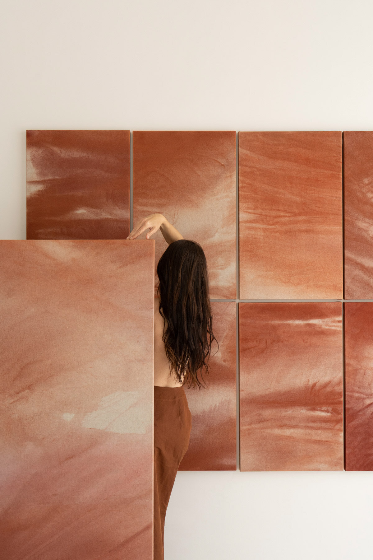
I’m all about simplicity that can make you feel. Currently, I work within four different art series, but they’re all united through a theme of tactility. Perhaps it’s easy to see in the works where I used dyed cotton paper that have a special texture. But even in my painted works, I work with layers and different textures of paint, so the piece isn’t too flat for the eye to observe.
What do you want your art to evoke?
I want to evoke curiousness, to both want to touch the pieces and to try and see what motives can be made out of them. For example, the art series ‘‘Patches’’ and ‘‘Patched Up’’ often look quite fragile and soft, but when you touch the pieces, you feel a whole other toughness of the works. Moreover, the title of my pieces often gives away little hints of interpreting the hidden inspiration for the pieces.
My first ‘‘Patches’’ that I made came from a need to repair an earlier big linen piece hanging over our bed. My daughter had been jumping up and down on the bed and accidentally kicked her foot through the piece, making a big hole in the middle of it. I patched it up using small squares of pigmented paper that I gently painted over, so the different textures still appeared. Now, this piece is hanging in my living room as a “prototype” and will never be for sale. And the tale of ‘‘Patches’’, in general, is so relevant today as it is also a story about fixing things when they are broken instead of throwing them away. Each layer tells a story.
That’s actually almost the same theme for my art series ‘‘Backwards’’, where I source old paintings and give them new life and aesthetics by painting a new piece on the back of the canvas. The back frame is often patinated beautifully and really gives the pieces something special that you can’t make from a new canvas. Again the layers of history add to the story and style of the piece.


“And the tale of Patches, in general, is so relevant today as it is also a story about fixing things when they are broken instead of throwing them away. ”
You seem to combine black and softer cream colors most of the time; why that choice?
I really would love to use more colors, and I have actually mixed up both reds, blues, and greens for when the courage hits me. However, as simplicity is still key, my main focus is still to make pieces that are not too noisy and where it’s still the layers and the textures that stand out and not a lot of screaming colors. That, for me, can be quite stressful to surround myself with. My mantra for my works is that they all should be something I would like to surround myself with in my home and be durable in that sense that I don’t get tired of looking at them. Often colors can do that to me unless they are used just right. So I think next up is experimenting with a touch of green.
What inspires your abstract shapes?
People do. I don’t paint figuratively, but almost all my painted abstract shapes are human figures. I hope I’m not the only one who can tell that from looking at the works. Some of my painted works from my last series were actually inspired by COVID-19 and the restrictions around physical touch. So I made big, simple figures almost touching each other—like a kiss about to happen with a painted shape on top hiding the real touching. It was called ‘‘Blurred Content’’.
In what kind of interiors do you see your paintings?
I hope I will see my works in most interiors; however, I guess most of my clients are people who live more or less in quite monochrome homes, where quality and rich textures are important. However, I would say that my pieces would also fit well into homes with more color and perhaps more maximal style, as the contrast is always a great balance.