Exploring Space Through Strong Colors and Simple Shapes with Visual Artist Ana Popescu
Exploring Space Through Strong Colors and Simple Shapes with Visual Artist Ana Popescu
Discover the Popping Illustrations of Artist Ana Popescu
Name:
Ana Popescu
Words:
Caroline Meeusen
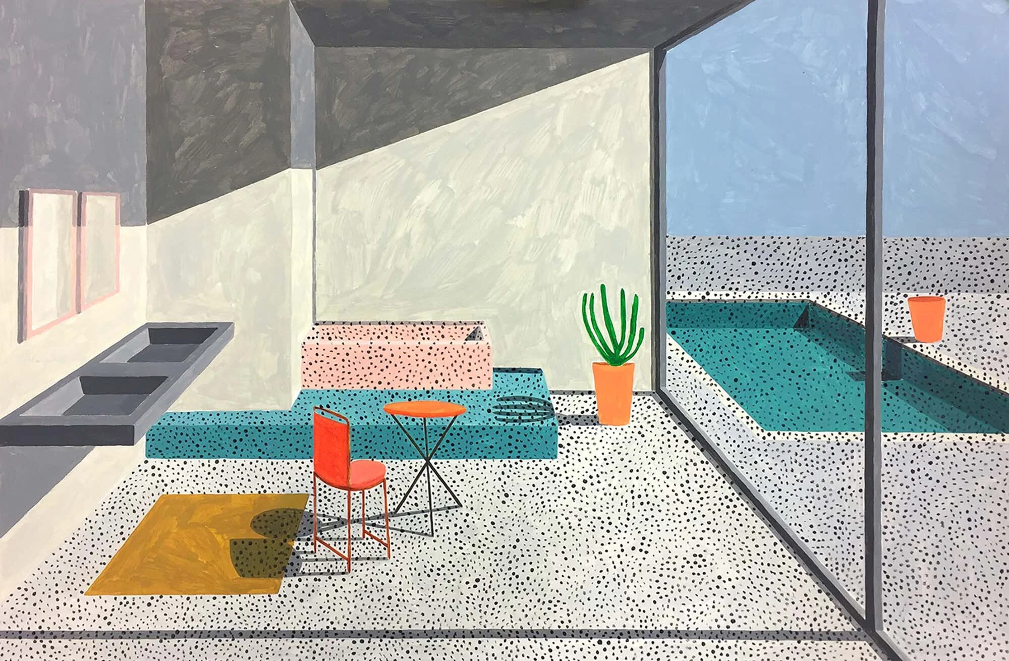
Ana Popescu is a French visual artist and illustrator based in Vienna, Austria who’s work catches your eye and doesn’t let go. Using strong colors and contrast and what seem like simple shapes, her illustrations are visually popping and have a sense of mystery to them as well. Before her art studies of printmaking and drawing at the University of applied Arts in Vienna, Ana studied Philosophy, History of Art and Sociology at the Eberhard-Karls-Universität Tübingen in Germany. Now, her works explore different themes and perception of space, focusing on the relation between inside and outside as well, which translates trough simple forms and vibrant colors. By portraying every day and average objects in different settings and contrasts, she gives them an extra dimension, a second life. The vibrant colors, simple shapes, use of light and shadow and occasional dotted patterns remind of the Pop art and Bauhaus movements and modernist landscapes.
Ana has worked with several renowned brands such as Google and Soho House as well as with furniture brand Tylko, which was “a match made in furniture heaven,” as Tylko notes. Together, they created a unique showroom piece. A special project since this was the first time Tylko created a shelf with an artist. It wasn’t the first time they worked with Ana, though. “Following our first collaboration, which felt like a match made in heaven, we’ve joined creative forces with Ana once again, this time to reimagine our Type02 Sideboard. Covered with her signature vibrant strokes, the result is a unique and playful furniture piece that would cheer up any room,” Tylko notes. Ana works very instinctively, piecing together several ideas and translating them visually in her drawings. “I found it interesting to work with Tylko in exploring ideas that would work within the context of furniture design. Since I work alone most of the time, collaboration projects can feel very refreshing. Also, seeing your work through the eyes of someone else, in this case Tylko’s, makes you see things in your art that you had never noticed before. We worked very closely to create a pattern that would both reflect my style, and match the design aesthetic of the brand. I think we achieved that pretty well,” Ana says.
In the interior concepts the shelf is placed in, we recognize her signature style immediately. Minimal decoration in a vibrant space with a rich palette of colors and patterns. “These interiors are all about the communication between the inside and the outside. The harmony between the shapes, the light and colors should also suggest peace of mind and feeling good at home,” she notes. Ana’s creative style certainly was the perfect choice for the visualization of this concept.
Ana Popescu x Tylko
Photography courtesy of Tylko
Ana Popescu x Tylko
Photography courtesy of Tylko


