Finding Softness and Robustness in Maria Osminina’s White Project
Finding Softness and Robustness in Maria Osminina’s White Project
Designer Maria Osminina Created Emptiness, Airiness, and Solitude in her Monochrome White Project
Name:
White Project
Designer:
Maria Osminina
Photography:
Maria Osminina
Words:
Caroline Meeusen
Within the strong geometry, robustness, and clean lines of Maria Osminina’s White Project we find a certain refinement and softness. The Russian interior designer from St. Petersburg has a great passion for art and design which began at an early age. Always drawing as a child, before studying at private art studios, the Mukhina Academy of Arts, and the University of Technology and Design, her first job was as an art dealer. A few years ago, she even founded her own contemporary art gallery: Inner Voice.
Her career in art flowed naturally into interior design projects where Maria works with natural materials, simplicity, and clean lines. “I do not recreate the lost, but maintain what is possible. I like when the interior looks modern and cultural at the same time. I love functionally thought-out spaces in which there is a feeling of air and emptiness,” the designer notes. Connecting her concepts to the entire context, including architecture, place, and trends, Maria realizes unique and interesting spaces.
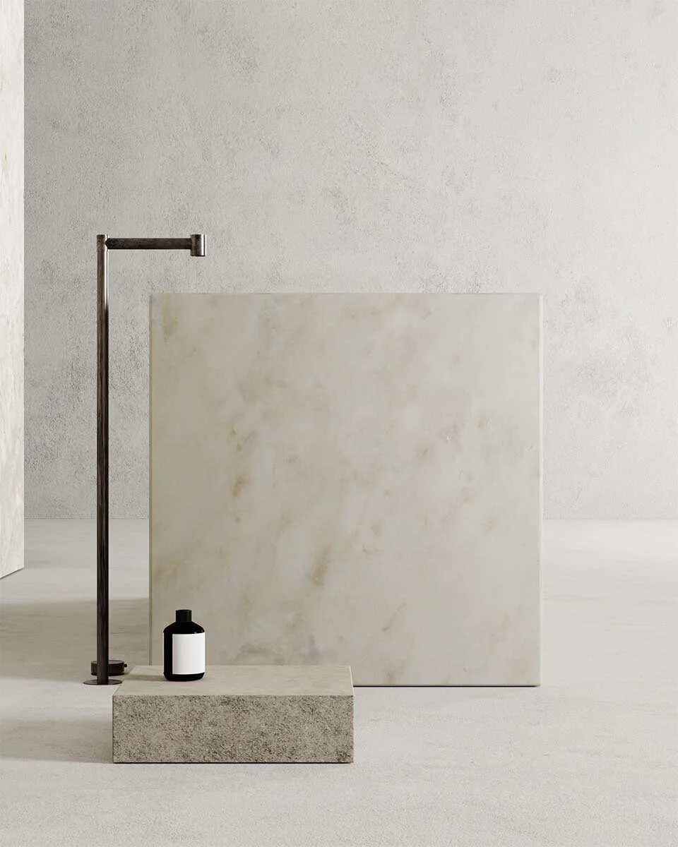
In her White Project, you recognize the emptiness she talked about. The modern setting is built up by strong geometric forms and clean lines with high openings. “In modern homes, I use clean lines, without imitating the features of old houses. I like it when all the details are not only superficial visual aesthetics, but also convey the essence of things in accordance with the time of creation,” she says. Through a play of texture, color, and light, this seemingly simple design becomes very sophisticated. “A sense of proportion and style without fuss and flickering is emphasized by subtle ratios of color and materials.”
Softening the straight lines of the walls and architecture as well as the massiveness of the kitchen and bathroom blocks, Maria opted for curved furniture. Using some iconic pieces such as an Ammanati & Vitello chair (1973), the Pantone chair (1960s) by Werner Panton, and a Ligne Roset mirror, she adds a touch of luxury and timelessness. “The intricate mirror creates a complex balance between strict geometric architectural lines, which is reinforced and finally revealed by the shape of the Pantone chair,” Maria adds.


