Discover Supaform’s Geometric Play With Furniture and Interior Design
Discover Supaform’s Geometric Play With Furniture and Interior Design
Founder Maxim Scherbakov talks combining shapes and colors into unique results
Name:
Supaform
Photography:
Supaform
Words:
Caroline Meeusen
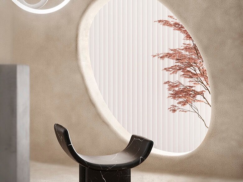
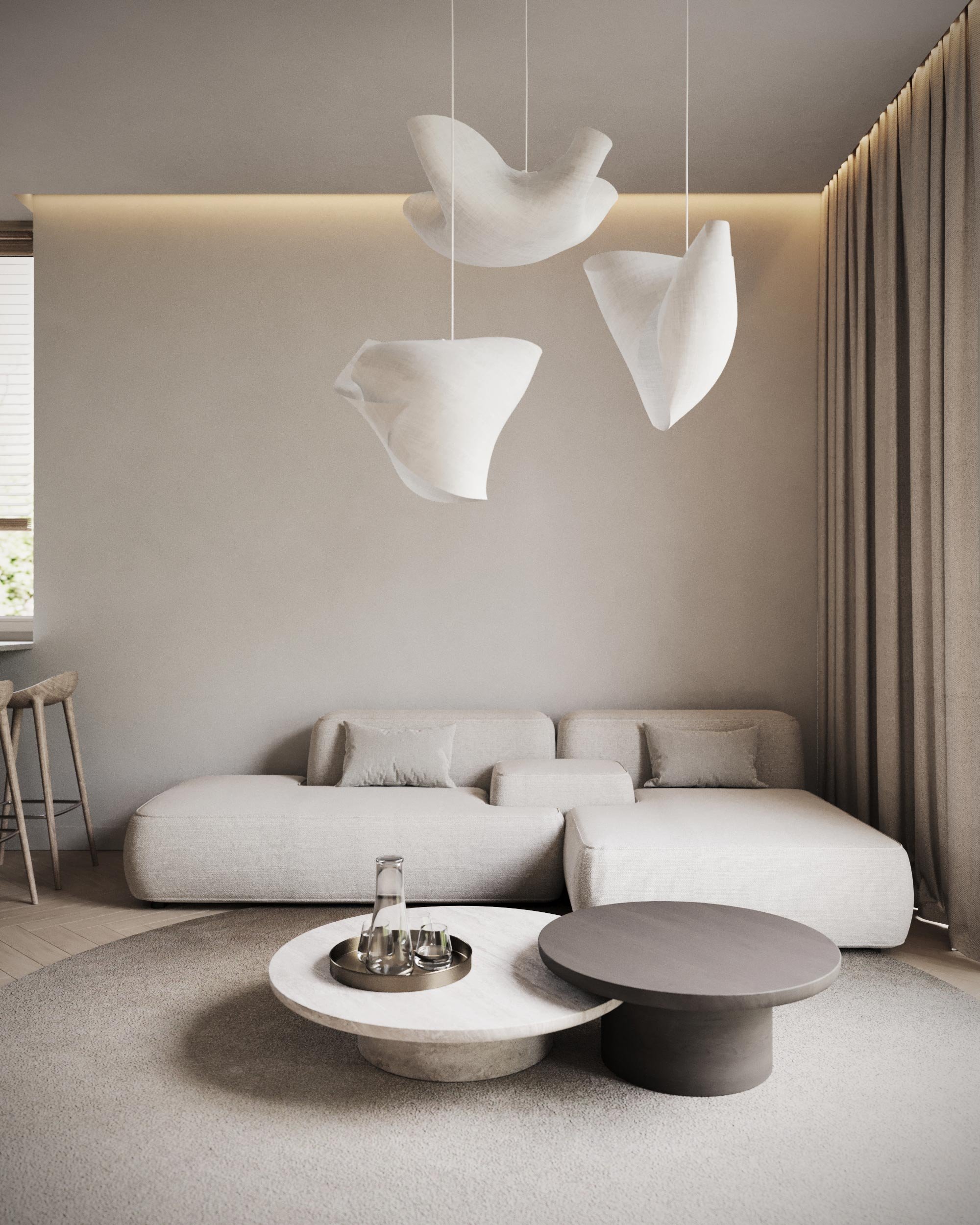
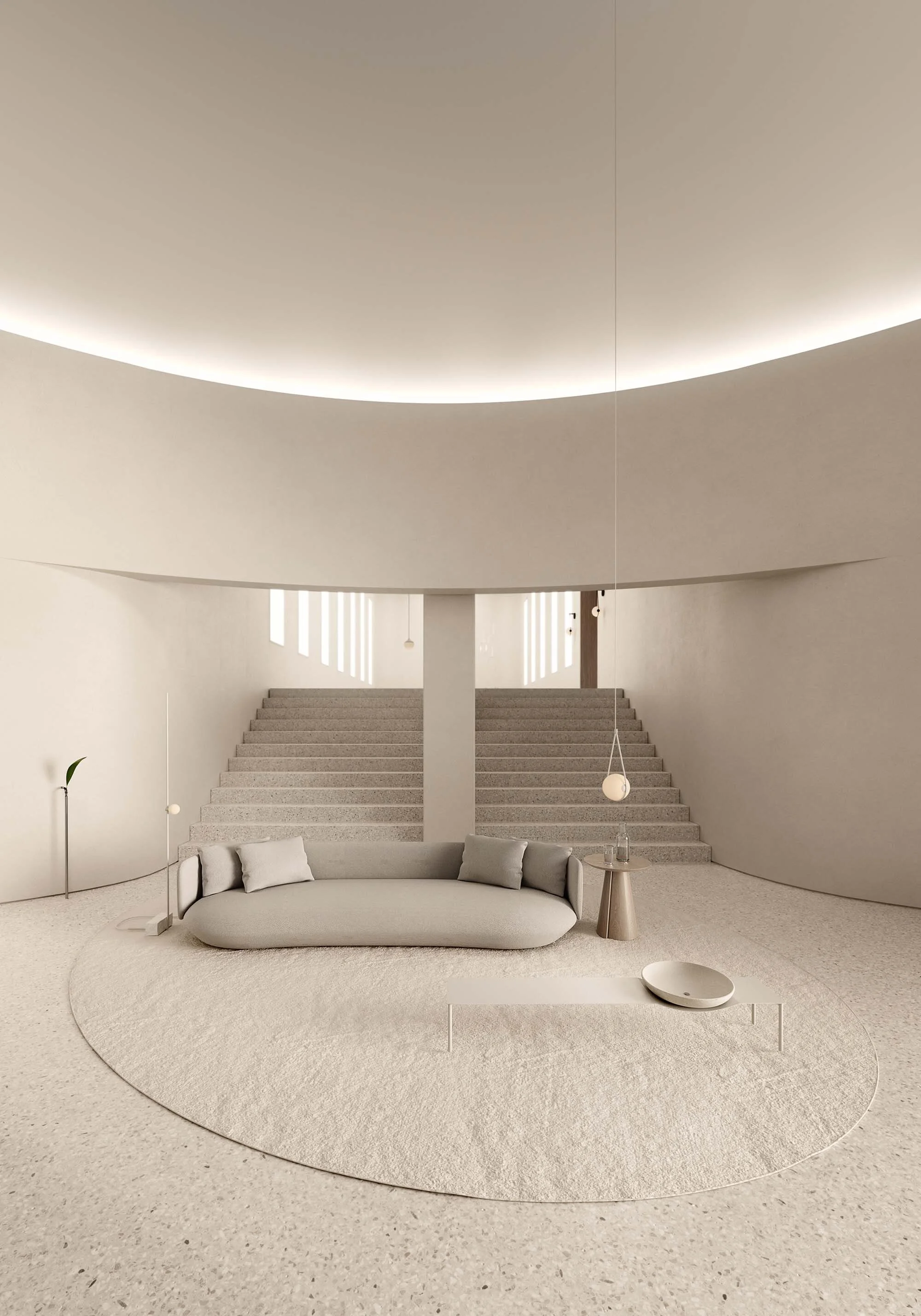
The Russian architecture and design studio Supaform pushes the boundaries of interplay between disciplines like architecture, sculpture, and painting. Founded by Maxim Scherbakov, the studio focuses on furniture and interior design with a geometric and playful twist. The visionary designs are unusual and seem minimalistic yet say it all by their strong, geometric and often colorful shape. Going back to the essence, the Supaform spaces and custom furniture pieces make use of strong contrasts both in color and in shape resulting in ever-interesting and playful creations with a retro vibe. Maxim Scherbakov takes us through his process.
VISUAL PLEASURE Magazine: How did you come up with the concept for Supaform?
Maxim Scherbakov: I tried some different fields of art before I came up with the idea to become a designer. I was involved in street art, skateboarding, DJing and painting. I think Supaform is a consolidation of all my different ways to become an artist. My aim was to create and use my imagination as my secret weapon. I started my design career as a recusant and I never pursued commercial success. I just was obsessed with design solutions which broke my own design stereotypes and my way of thinking.
How would you describe Supaform’s style?
Style is unstable and it changes. I appreciate the idea not to be ‘in style of.’ Yes, all my stuff is some kind of contemporary and sometimes mid-century, but I like to transform it and go beyond the style. I love a little bit of retro-futuristic pieces as well as contemporary and cutting-edge design.
Does Russian culture have an influence on your work?
Yes and no simultaneously. I strive to be a part of the worldwide design scene and I'm not interested in representing Russian culture alone. I love some identic details of Russian culture. Sometimes it's cool to make objects or interiors by rethinking something strange or even ugly. We have a lot of uncool stuff like chip soviet furniture or some utilitarian solutions which are absolutely not about the design. Also, I can mention Russian heritage which is also a part of Russian culture. I mean Avant-garde and Constructivism of course. I realize what the worldwide meaning of Russian Avant-garde and Constructivism is. I'm really proud of Russian-born Avant-garde artists when I see their works at the Guggenheim museum in New York or other museums in the world. All in all, I'm Russian born and my culture is inside me.
What inspires you most in life?
I like to find beauty in strange and controversial things. It's like an attention to detail which surrounds us in everyday life activities. I'm inspired by the possibility to create something interesting and new for me, to hunt on a beautiful idea and then to embody it.
How do you come up with new ideas for furniture?
Sometimes it's a long and multiple process. It's like an immersion in the topic which you are interested in. Then you go deeper into the theme and try to find the seed. Sometimes I appeal to my notebook and make some quick sketches. Often these sketches become embodied. I frequently use my accumulated impressions from good movies, listening to music and traveling. Ordinary things.
It seems that you love to use geometric forms and bright colors. Why is that?
I love painting. My first education was of pictorial art. Working with color is what I do best. It's like a secret ability, you just feel it. My second education was in interior design and an architecture of small forms. My pieces are like small architecture. I love proportions and nice interrelations between parts. Geometric form is a sophisticated object with its own rules. The color for a piece is like a soundtrack for a movie.
Your furniture and interior designs look playful yet also sophisticated and elegant. How do you find this balance?
I don't want to seem like a wiseacre, but I think that you have to get some knowledge in different fields of art to shape your own and unique approach. You can use existing methods and trendy techniques but unfortunately it will just be a wrapper. At least I feel that way. I just want to say that the balance you mentioned is a result of my own experience.
How do you make sure that all the colors and shapes used together don’t become too much and messy?
I work a lot. And by that, I mean that I make a lot of variations and always think about each element in the scene and its interrelations between each other. This approach usually helps me to avoid some kind of messy result. But sometimes messy is good too, when ‘too much’ is under control.


